

« The Ducati Team returns to action in Jerez de la Frontera for the opening Grand Prix of the 2020 MotoGP World Championship. | Main | Porsche Ranks Highest Overall in J.D. Power APEAL Study »
July 24, 2020
Nissan redesigns its Logo.
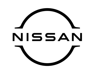
Photo: Nissan. New Logo.
Photo: Nissan. Current Logo.
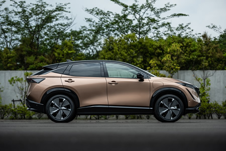

Photo: Nissan Ariya. Image provided by & copyright ©, Nissan.
New York, July 24, 2020 — At its World Premiere Event, filmed in Yokohama, Japan, and streamed virtually around the world, Nissan last week unveiled a new brand logo and visual identity, symbolic of a new chapter in its history.
Nissan would feature the brand’s bold, modern redesign on Nissan’s website and communications materials around the world. The new emblem will first appear as an illuminated badge on Nissan’s all-new flagship electric vehicle, the Nissan Ariya, arriving in 2021.
For the past 20 years, Nissan’s outgoing Logo has been a beacon on its vehicles and so much more. It has served as an identity, a business card, a handshake, and the first greeting between customers and the driving excitement that Nissan vehicles provide. For decades more, Nissan’s Logo has stayed true to a belief held by its founder Yoshisuke Aikawa, “Shisei tenjitsu o tsuranuku,” which he interpreted to mean, “If you have a strong belief, it penetrates even the sun.”
Nissan’s new Logo comes alive as it pivots to the future while staying connected to its rich heritage and innovation tradition. The company name remains at the center of the Logo, communicating an instantly recognizable brand that evokes past milestones and memories while also conveying evolution, Nissan said.
In 2017, Alfonso Albaisa, Nissan’s senior vice president of global design, began to study potential changes to Nissan’s Logo and brand identity. He set up a design team led by Tsutomu Matsuo, deputy general manager of Nissan’s advanced design department, to study everything from a subtle evolution to a complete reinvention. Albaisa offered the keywords “thin, light and flexible,” and set Matsuo and his team on their journey.
“Inspiration was drawn from breakthroughs in science, technology, and connectivity. How these have brought fundamental changes to our customers,” said Albaisa. “As you can imagine, visions of digitalization started swirling in our heads.”
Over the next two years, the team sketched and plotted several iterations, always keeping Aikawa’s directive words in mind: “be passionate, be an innovator, be a challenger.”
The team needed to consider several variables, including an early decision for illuminating the Logo on upcoming all-electric models. It presented technical challenges, such as gauging the thickness of the Logo’s outline to ensure a crisp impression when lit, and of course, compliance with government regulations for illuminated elements on cars. The Logo also needed to make a strong impression when not lightened, when it appeared digitally or on paper, the company explained.
No matter what is the medium, this new Logo needed to stand for Nissan unequivocally, and do so with impact. After countless sketches and several mock-ups, the result was a logo with a two-dimensional impression. Looking more designed than manufactured, it has the flexibility to live in multiple worlds. The process started in 3-D and then developed in 2-D, Nissan elaborated.
Nissan said that the redesign’s overall effect is a transition from a hard-edged, industrial feel to a refined, familiar, and digital-friendly look. It signals the evolution of Nissan as a traditional vehicle manufacturer to a provider of mobility and services.
“The new Nissan logo communicates our guiding message, carried over from past iterations: If you have a strong, determined belief, it can even penetrate the sun,” said Matsuo. “At Nissan, this strong belief in the power of achievement has never wavered and can be seen in our pioneering efforts in electrification, driver assistance, and digital connectivity. Our Logo has to convey this in a glance and show our commitment to our customers, employees, and society.”
The carmaker informs that the new Logo will begin appearing in July, both in digital and physical forms. Nissan’s electric vehicles will feature an exclusive illuminated logo lit by 20 LEDs (corresponding to the number of years between logo redesigns). It is a prominent visual reminder that Nissan is driving towards an electrified future.
After that, the new Logo would appear across mediums, from letterhead and dealership signs to social media and digital advertising.
According to Nissan, the recently unveiled Nissan Ariya, the first crossover EV for the brand, would be the first car to illuminate the new Logo. Ariya is the new icon of Nissan Intelligent Mobility, designed to fully embody the three pillars of Intelligent Driving, Intelligent Power, and Intelligent Integration.
“The Nissan Ariya is our latest electrified vehicle, packed with advanced technology,” said Albaisa. “It’s the perfect platform for this new logo.”
Additional vehicles would sport the new Logo in the coming years as the latest chapter of Nissan evolves, the company stated.
Source: Nissan Motor Company
|GlobalGiants.Com|
A New Day for Nissan.


Edited & Posted by the Editor | 12:41 PM | Link to this Post